La Barbara
From a local restaurant to a must-visit hidden gem travelers talk about.
An intimate, Japanese-style speakeasy designed for deep conversations, mystery, and a complete sensory experience.
Located in Casco Viejo, Panama, La Bárbara is a 25-seat restaurant with a strong focus on Japanese cuisine and premium cocktails. While the quality of the experience was already exceptional, the brand lacked a clear visual language to express its essence and stand out in a saturated hospitality scene.
The challenge was not to reinvent the experience, but to translate what already existed into a brand that felt intentional, memorable, and true.
La Bárbara had already established its presence since 2019. However, by 2025 it was time for a change: a new location just a few blocks away. With this move came the opportunity to rethink and evolve both the brand and its concept.
–
A new beggining
THE CHALLENGE
Enhancing the experience
- How could we elevate the experience and meet the expectations of our regular guests while also attracting new travelers and locals, without losing our essence: an intimate, calm place? They wanted it to be recognized as a carefully crafted speakeasy designed for meaningful experiences.
- How could La Barbara refresh its iconic “B” brand symbol without losing its identity?
- How could we evolve the brand intentionally while projecting a Japanese-inspired identity that avoids the classic red-and-black restaurant stereotype?
THE SOLUTION
A mystical, green Japanese aesthetic
- I began by crafting a strong, memorable narrative rooted in strategy. By defining a clear positioning and creative direction, the identity was designed to feel quiet, intentional, and human. Storytelling inspired by the Japanese fox, Kitsune, became the core of the visual system, inviting curiosity and emotional connection.
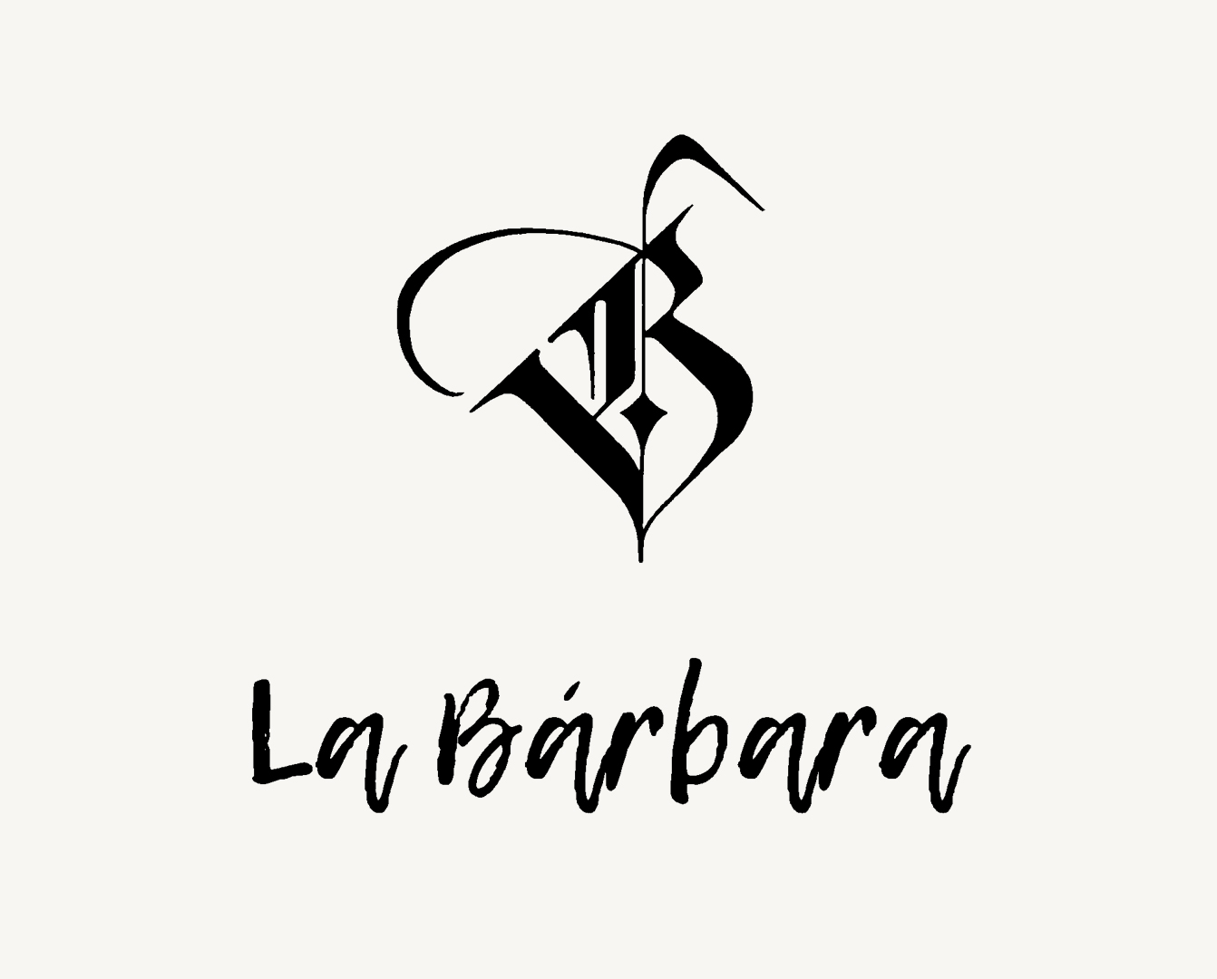
- I updated the iconic ‘B’ with a style inspired by traditional Japanese hand-drawn ink and brush strokes. As the long-standing face of the brand, preserving it was essential. This evolution was designed to feel like a thoughtful refresh and refinement, not a complete transformation, so loyal guests would feel excited to experience this new chapter of the brand.
- It is uncommon to see a Japan-inspired brand led by green as its primary color, so a deep, mystical green was chosen to project calm, depth, and distinction. This decision helped the brand step away from familiar visual clichés while establishing a unique and recognizable identity.
The Foundation of the Brand
A.K.A. The most important part of the process
People don’t buy what you do;
they buy why you do it.
-Simon Sinek
Brands should speak from their “why”: their purpose, their reason for being, and the motivation that drives everything they do.
LA BARBARA’S WHY
La Barbara is dedicated to its audience, creating extraordinary, intimate, and memorable experiences that last a lifetime.
LA BARBARA’S AUDIENCE
The Experience-Driven Explorer
They are driven by places that offer depth, intimacy, and a sense of discovery worth sharing.
Experience over spectacle
Having traveled extensively, they has already seen it all and trendy places no longer impress them.
What they seek instead:
Quiet, intimate spaces where the experience unfolds slowly and feels intentional.
Connection as a form of luxury
For this audience, luxury is not defined by price, but by the quality of the moment. Deep conversations, attentive service, and atmosphere become the true value.
Discovery-driven behavior
They actively search for the best spots when traveling and rely heavily on reviews and recommendations.
Emotional shareability
Their goal isn’t just to enjoy the experience, but to share it with others: friends, family, and the internet.
LA BARBARA’S CONCEPT
A Peeking Eye Behind a Shoji door
The creative concept was inspired by the idea of a hidden world, revealed only to those willing to look closer. This metaphor became the foundation of the brand’s visual and narrative system.
Japanese cultural elements, such as ukiyo-e, traditional art references, and symbolism were reinterpreted in a contemporary, handcrafted way.
A speakeasy already loved by many evolved into a must-visit destination in Panama, highly recommended by travelers and locals alike.
I brought the new brand to life through every touchpoint
The identity comes to life across menus, printed materials, and a beautiful website. Every touchpoint was designed to feel intentional, inviting, and coherent with the overall atmosphere of the space.
Rather than isolated pieces, the brand works as a system, supporting the experience from the first impression to the final detail.
A menu should guide the experience
One of the most important touchpoints of the brand. I designed a tall, clean, and elegant menu that showcases icons to categorize each dish and drink.
I even designed a custom illustration for the entrance door
Inspired by traditional Japanese art, a fishing fox watches us with an unsettling gaze. It subtly connects La Bárbara to its surroundings, referencing Bruma, the seafood restaurant guests pass through before entering the space.
Yes, the entrance is behind that painting on the wall.
The brand also lives in the digital space
I designed everything from highlight covers to different types of posts and stories, reinforcing consistency and brand positioning across digital touchpoints.
And lastly, a beautiful website
Beyond showcasing the new brand identity, La Bárbara’s website was designed to function as a digital menu, allowing guests to explore the full catalog of dishes and order digitally.
THE OUTCOME
It's all about the experience
It goes beyond aesthetics. It’s about creating a genuine connection with guests and carefully designing every touchpoint in the user journey, ensuring they leave with the best experience they could have during their visit to Panama.
Projects like La Bárbara are the ones I enjoy the most, as they open the door to creating a full experience, beginning with a captivating narrative that brings depth and richness to the entire visual system.
The process begins long before design, starting from within, through strategy. By defining a clear positioning, purpose, and narrative, we build a strong foundation rooted in a deep understanding of who the brand is, what it stands for, and the experience it wants to create.
With this strategic core in place, every decision becomes intentional. The visual identity is then designed as a system, one that feels human, thoughtful, and real, allowing the brand to speak clearly to the right audience. The result is not just a cohesive identity, but meaningful connections and experiences people remember, recommend, and can’t wait to repeat.